Mismatched bridesmaid dresses are one of my favorite things.
Anytime I photograph a Seattle wedding and the wedding party is wearing a variety of colors, patterns and styles my heart skips a beat. I love seeing a color palette come to life across different dresses and I think it’s really fun to be able to give bridesmaids freedom to choose their own dress style and color for your wedding (within your chosen parameters, of course). Coordinated, matching wedding parties are still the norm but the mismatched look is something that you should seriously consider for your wedding, especially if you are having trouble settling on a specific color or dress style, or are choosing to have a more relaxed vibe at your wedding. Did I mention that I think mismatched bridesmaid dresses photograph incredibly well? To provide you with a little inspiration, here are five of the most gorgeous wedding parties with mismatched bridesmaid dresses that I’ve gotten to photograph and why I think each one looks A-MA-ZING.
Teal-Inspired Wedding at Rosehill Community Center in Mukilteo
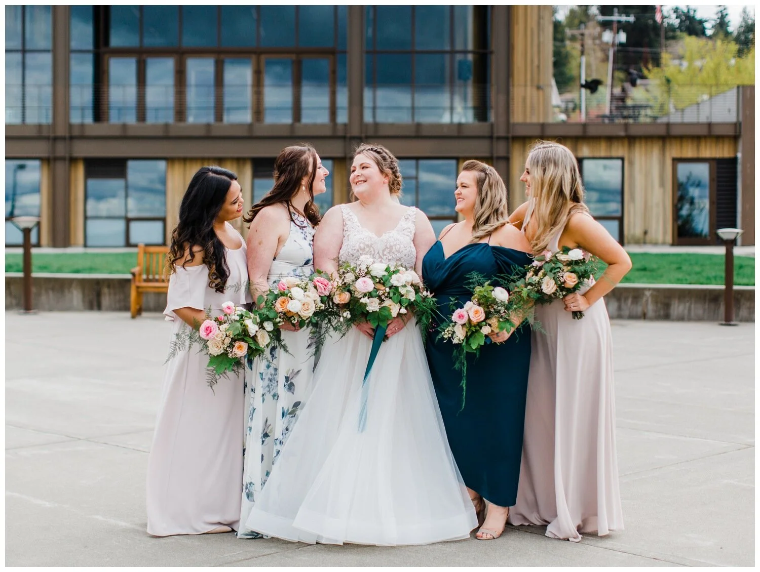
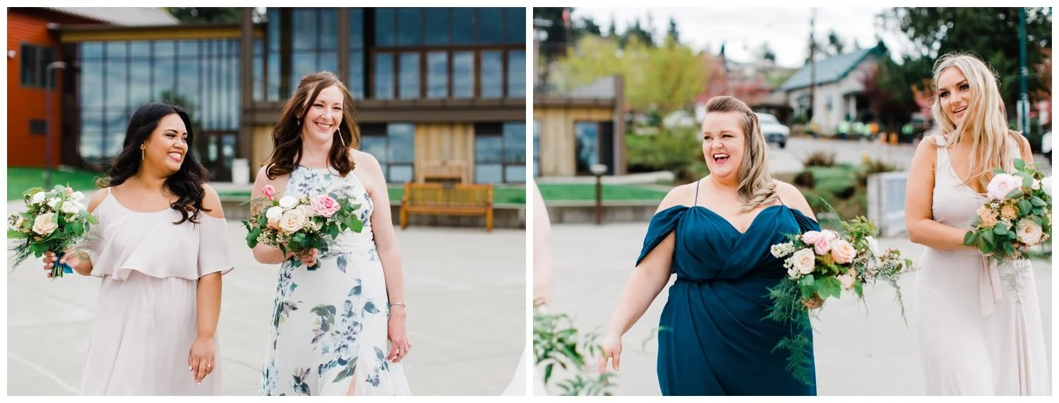
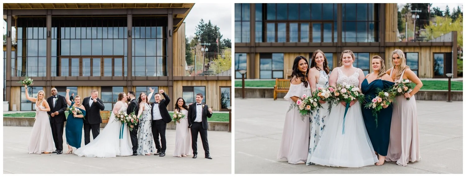
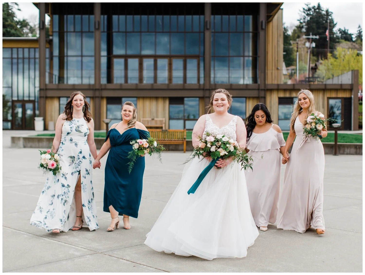
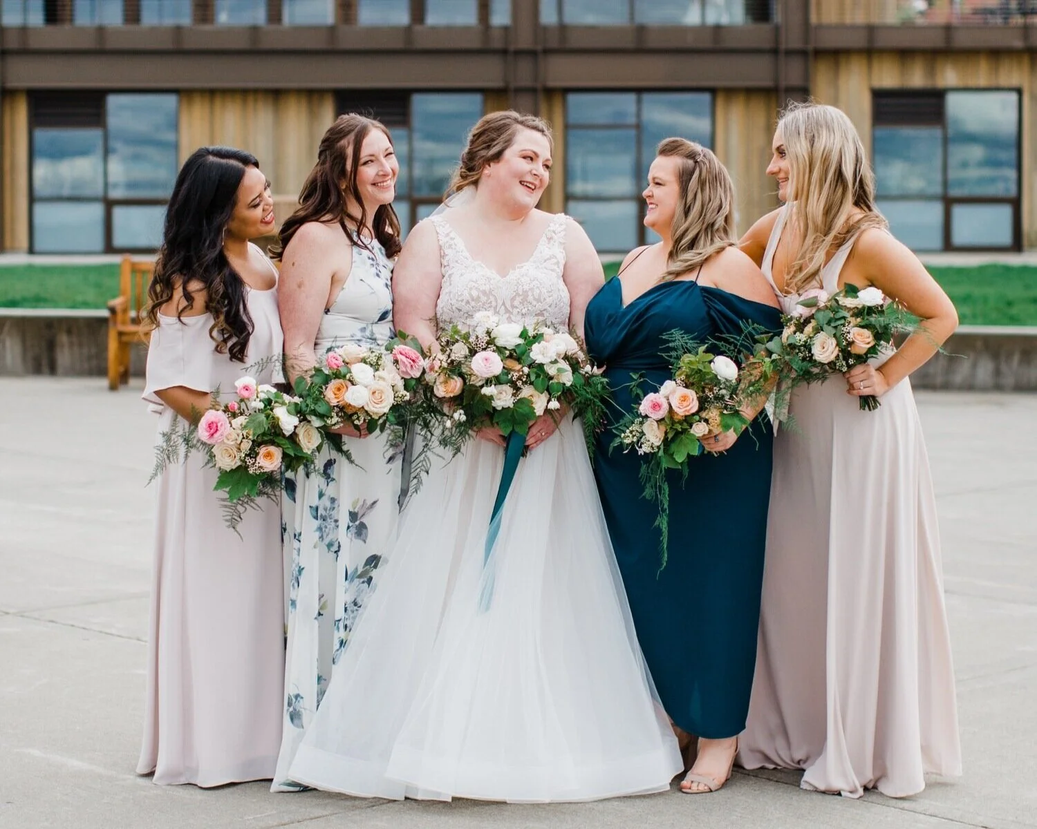
I’m a sucker for bold color and teal is as good a choice as any! When putting together a color palette for your wedding outfits and decor, choosing a vibrant color works out well when the rest of the color palette is on the more neutral, less-saturated end. In this case, Mary was directly inspired by the teal color that she chose for the ribbon on her bouquet and opted for a color palette that embraced it! A saturated, vibrant hue like teal will be memorable without feeling over-powerful if it is complemented and accented by more neutral or desaturated tones like dusty grey or off-white, or with a floral/print pattern that’s largely neutral in color. By sticking to a color palette of teal, white and blush, Mary & Mike’s wedding party style was taken up a serious notch. Don’t be afraid to include pops of bold color into your wedding design and dress options for your bridesmaids (or tie options for groomsmen). Just remember to balance out bold with some neutrals and you will be all set!
Blue and Boho Styled Wedding at the University of Washington Center for Urban Horticulture.
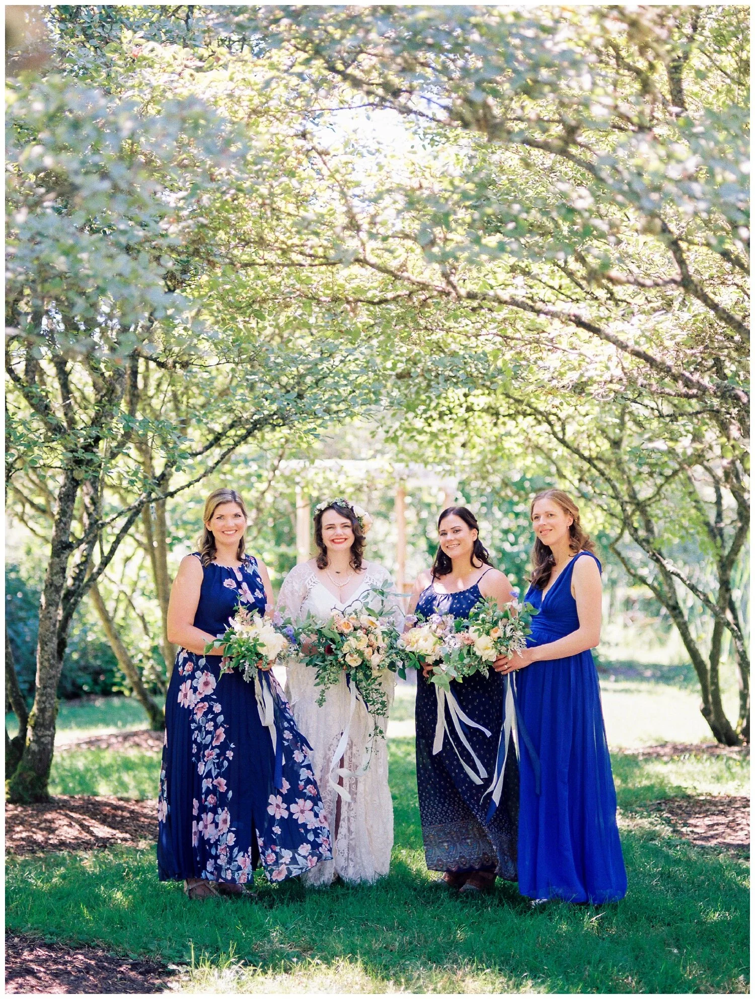
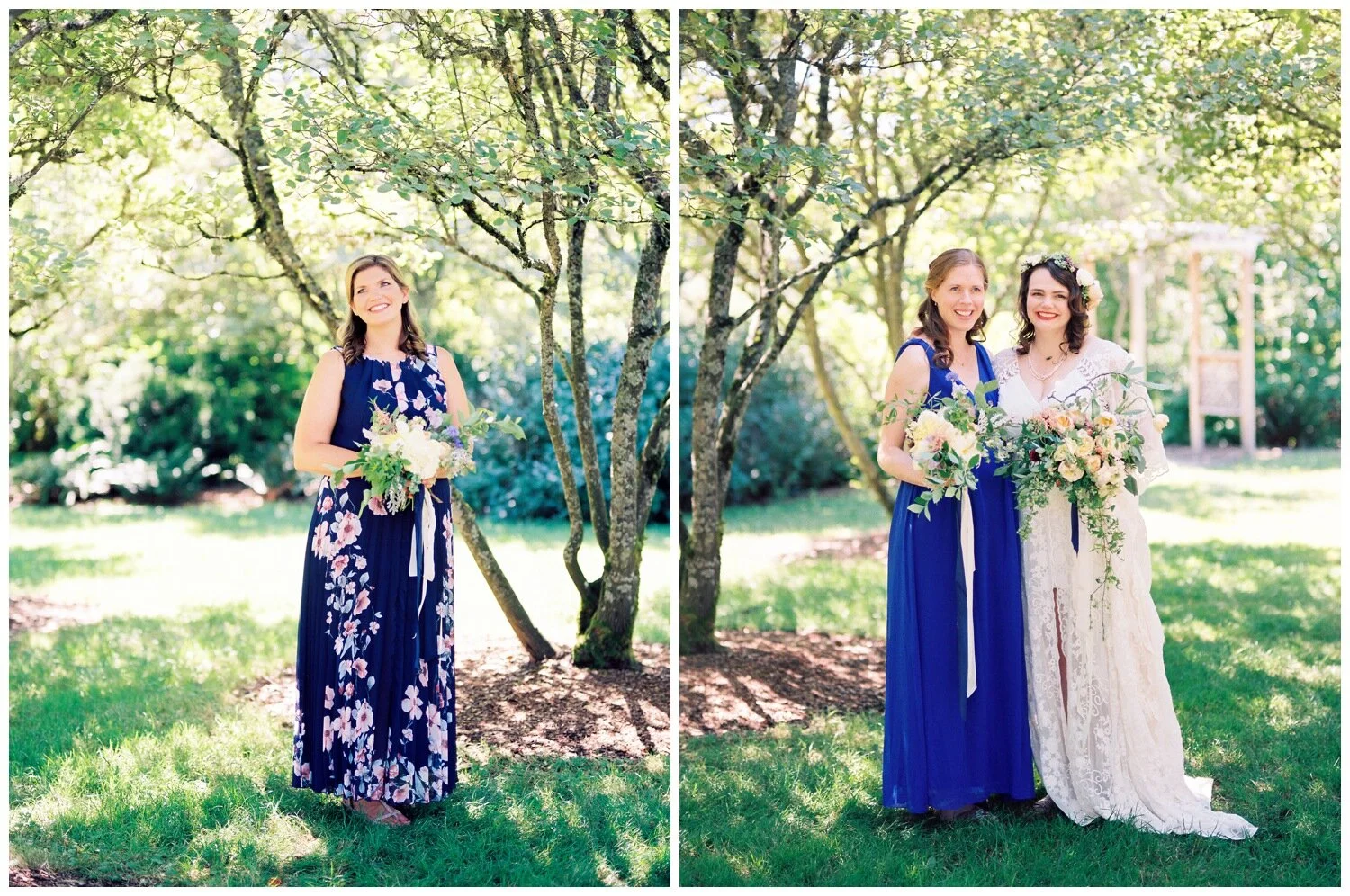
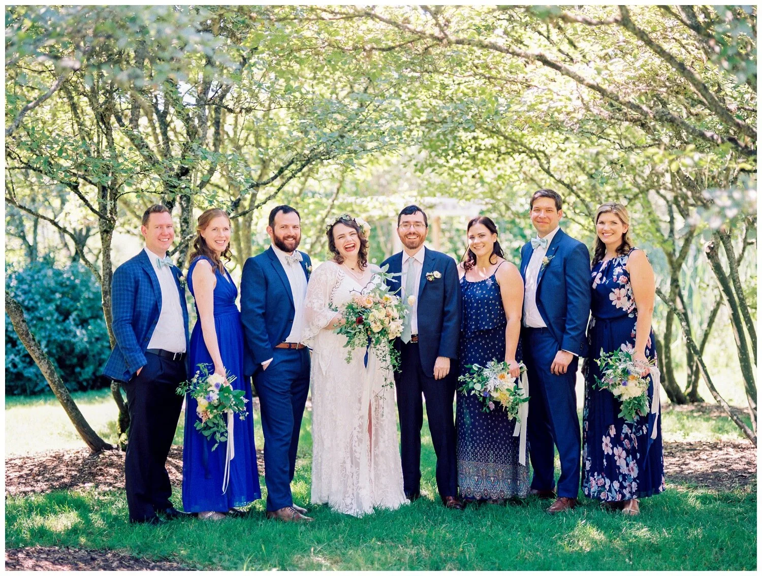
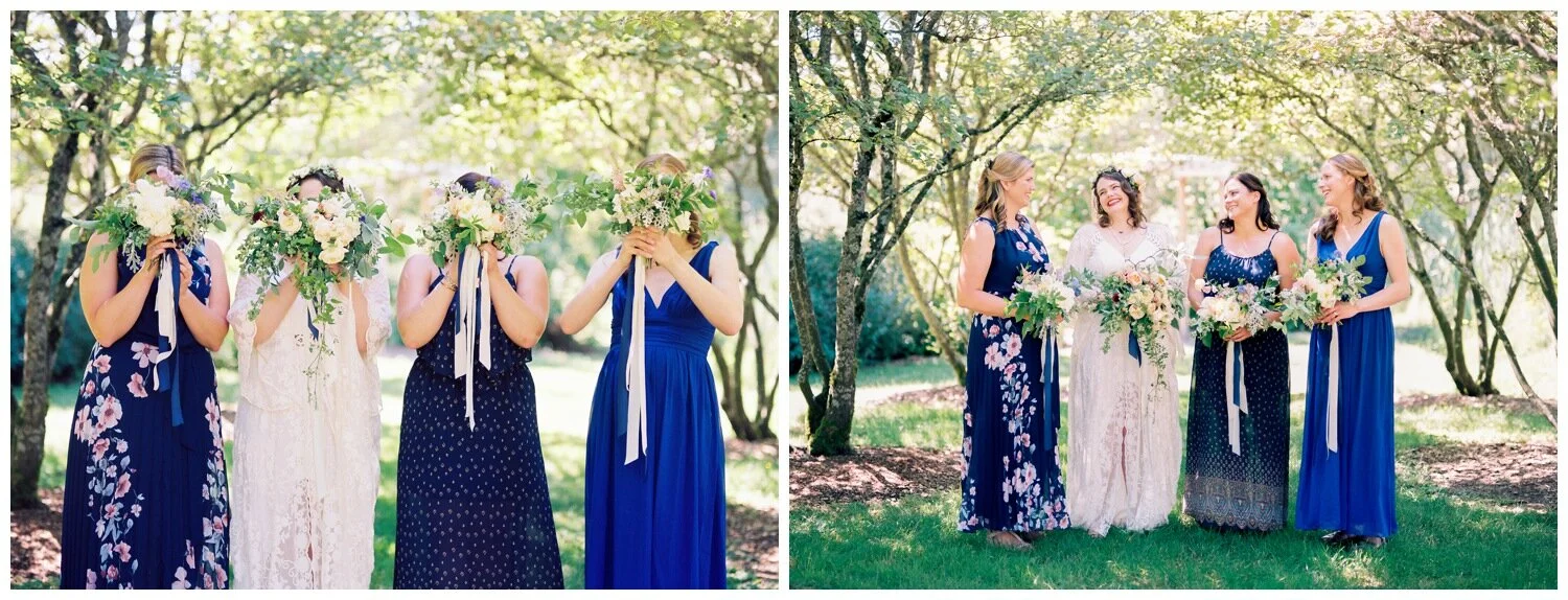
Katharine & Ed’s summertime wedding at the University of Washington Center for Urban Horticulture was a perfect setting to embrace rich navy and royal blue tones to contrast against the gorgeous gardens and whimsical bouquets. My choosing a specific color and encouraging her bridesmaids to go for a print if they wanted, Katharine’s attendants wound up creating a gorgeous and coordinated ensemble despite the fact that their dresses aren’t identical. I especially love the fact that the groomsmen had simialr freedom at this wedding! Using the royal and navy blue direction, the groomsmen were able to wear a suit of their choice, one of them opting for some pattern in his wardrobe as well! When considering your wedding colors and style, keep the venue in mind. Is it outdoors, indoors, light and bright, dark and moody? Choosing a color palette or theme that contrasts against the vibe of your venue is a great way to go and Katharine’s wedding party pulled this off in style.
Pale Neutral and White Wedding Party Style at Stocker Farms
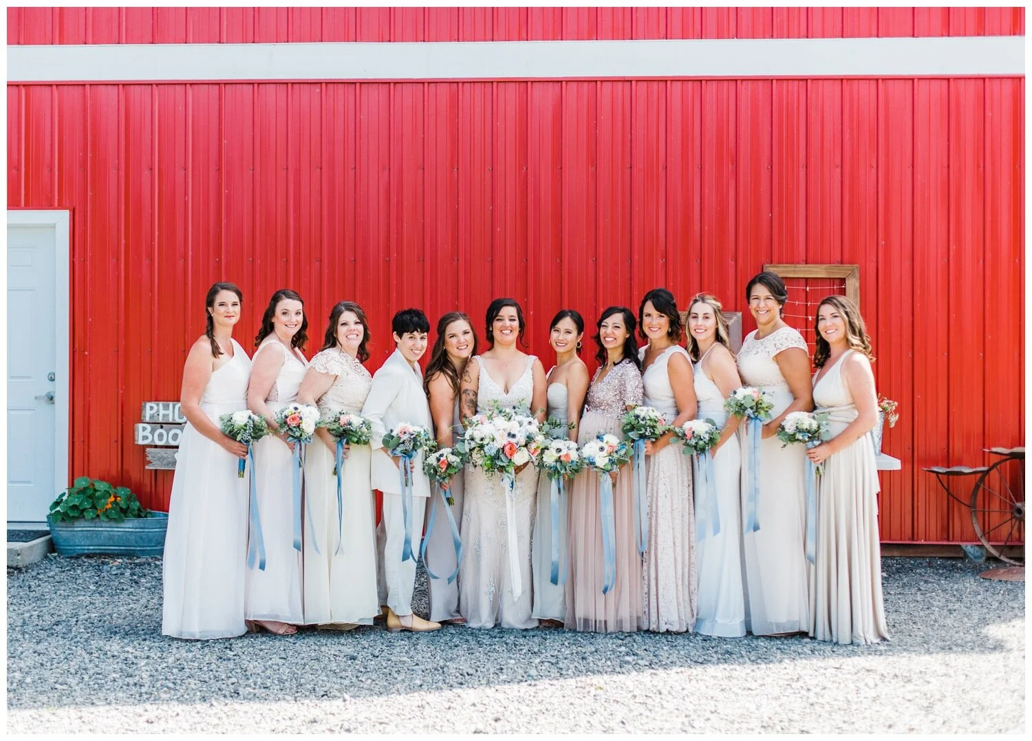
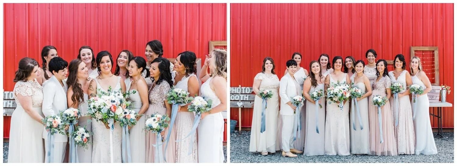
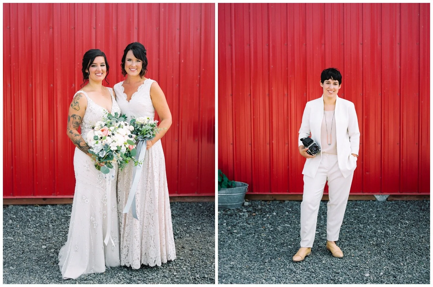
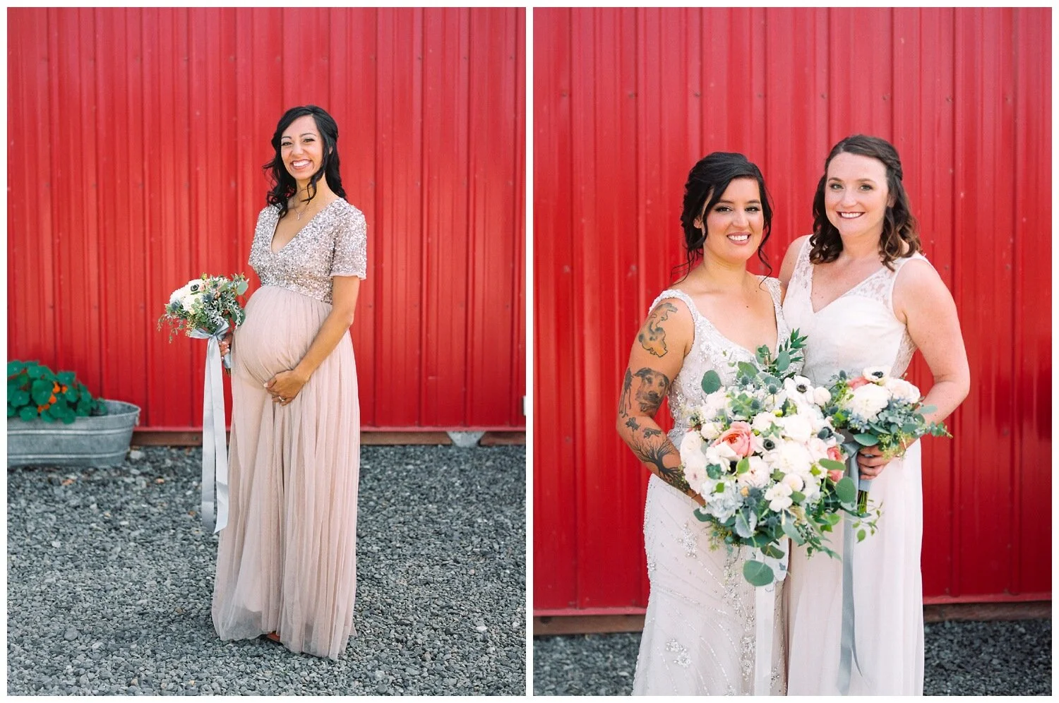
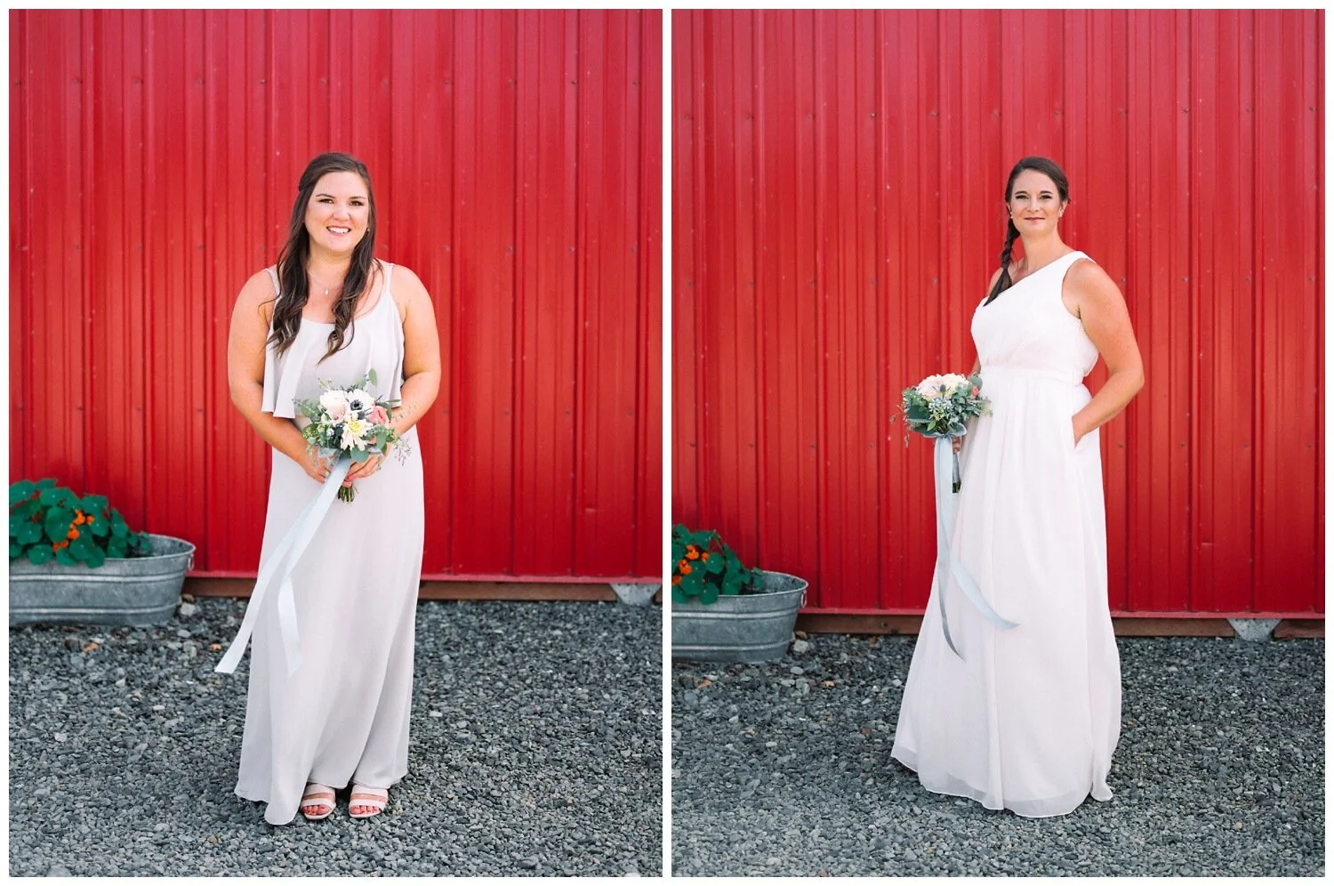
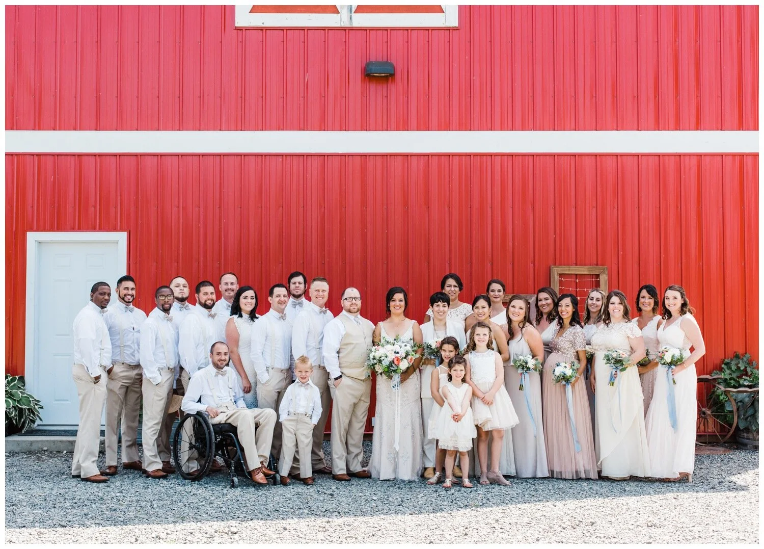
A mixture of bright neutrals always looks stunning and the ladies in Gabi & Trevor’s wedding party look incredible! Don’t you think? Gabi and Trevor also get kudos for having one of the largest wedding parties I’ve ever photographed. The bridesmaids were able to elect for dresses in the dove grey, white and dusty pink family and they look awesome. By giving her bridesmaids some minimal direction – the color family and that she preferred the length of the dresses to be to the ground, these ladies look stylish and coordinated while each being able to embrace their own style preferences. Aiding in this coordinated look is the fact that the bridesmaids have matching bouquets and the light blue ribbons accent the light colors of their dresses. This wedding party also embraced non-dress options, as Gabi’s sister opted for a super polished blazer and coordinated pants as her wedding ensemble. One more detail really giving this wedding party look an extra boost is Gabi’s off-white ivory dress that was absolutely covered in beading and intricate lace work. The texture and detail of her dress stood out beautifully against the fabric choices by the bridesmaids, as they largely opted for plain materials without embellishment.
Metallic and Jewel Tone Wedding Party Ensemble at the Seattle Four Seasons
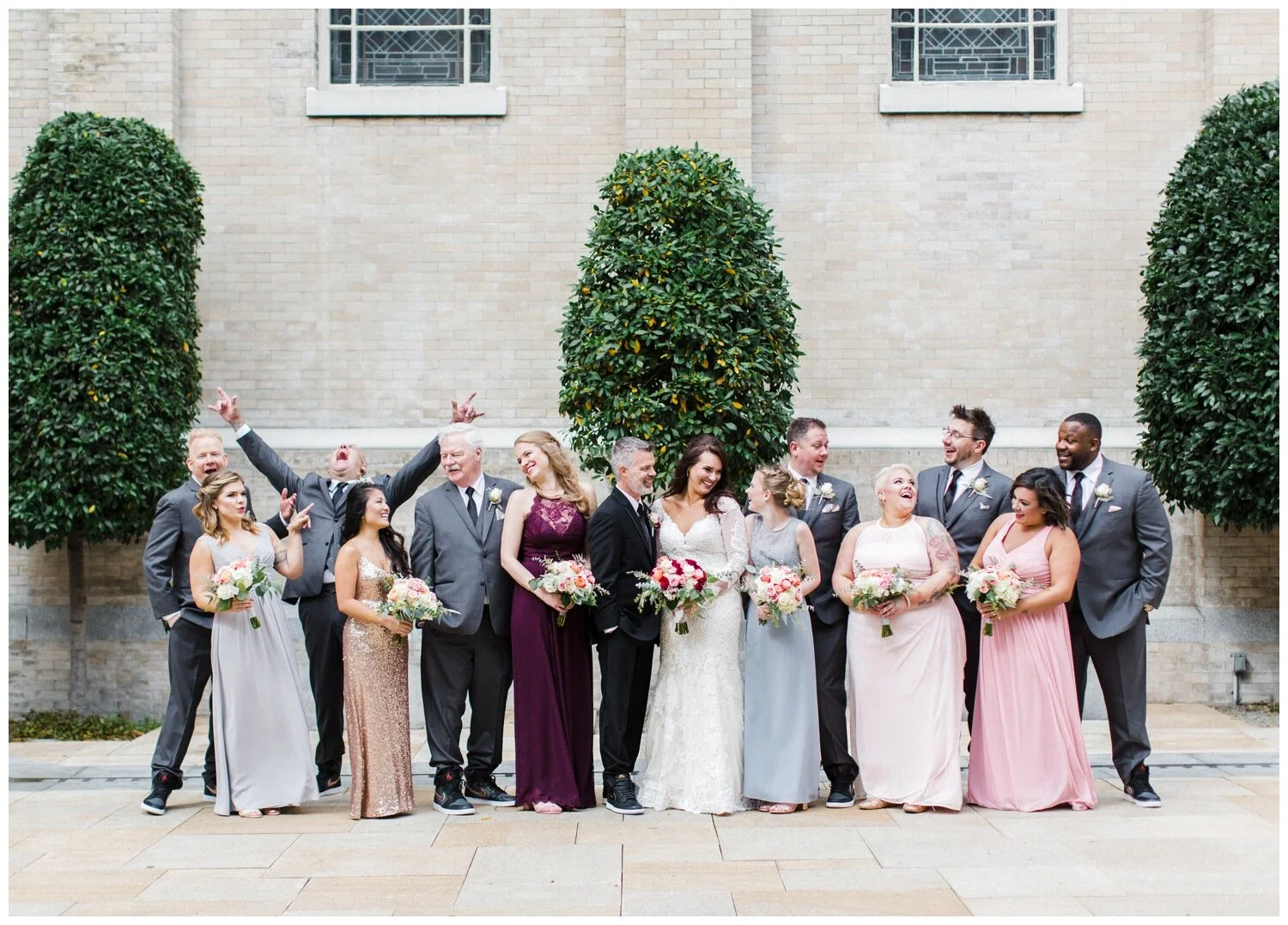
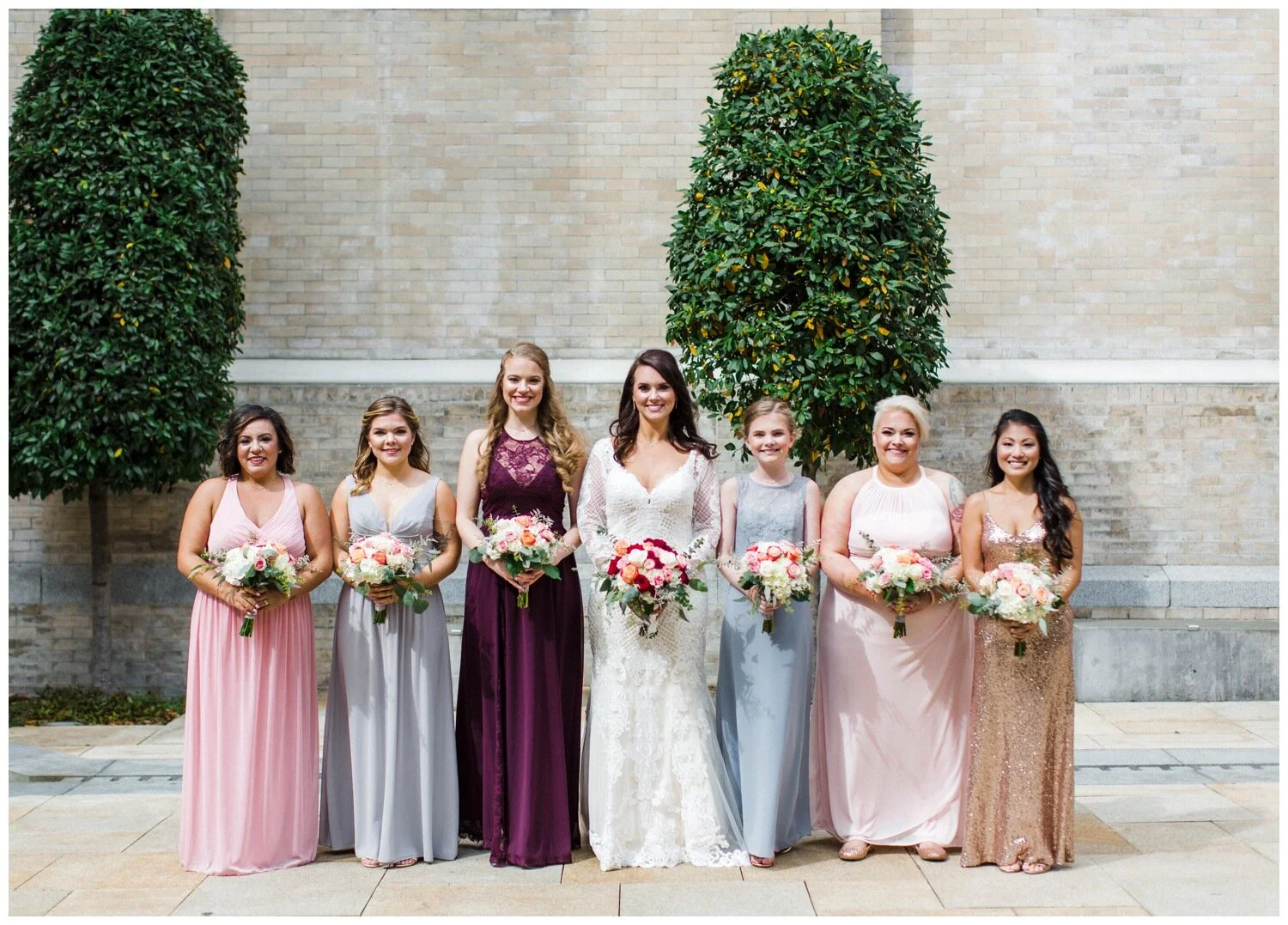
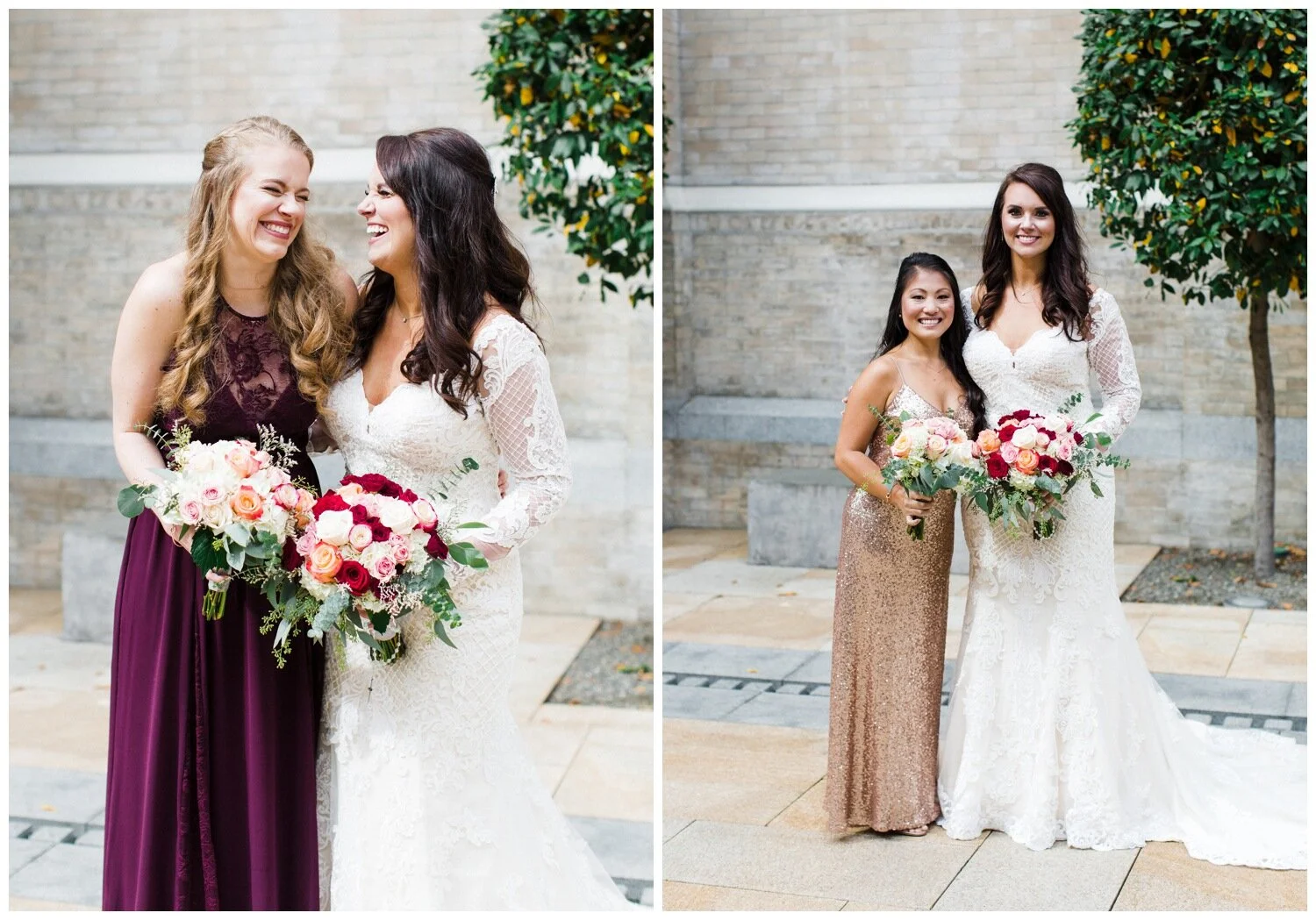
Rachel & Bender’s combination of jewel tones and neutrals makes for a fun, yet formal looking wedding party, which was perfect for their church wedding in Seattle. When putting together a color family for your wedding I suggest minimizing your bold color selection to a single dark or saturated hue, and complimenting options that always work are less saturated or brighter versions of the same color or one right next to it on the color wheel, as well as desaturated neutrals like the grey dresses in Rachel’s wedding party. You can’t go wrong with including metallics when you’re working with jewel tone’s, and Rachel’s bridesmaid who sported a gold sequin dress rounded out the color family chosen for this wedding party.
Mardi Gras Inspired Teal and Purple Bridesmaid Dresses at a Seattle Waterfront Wedding
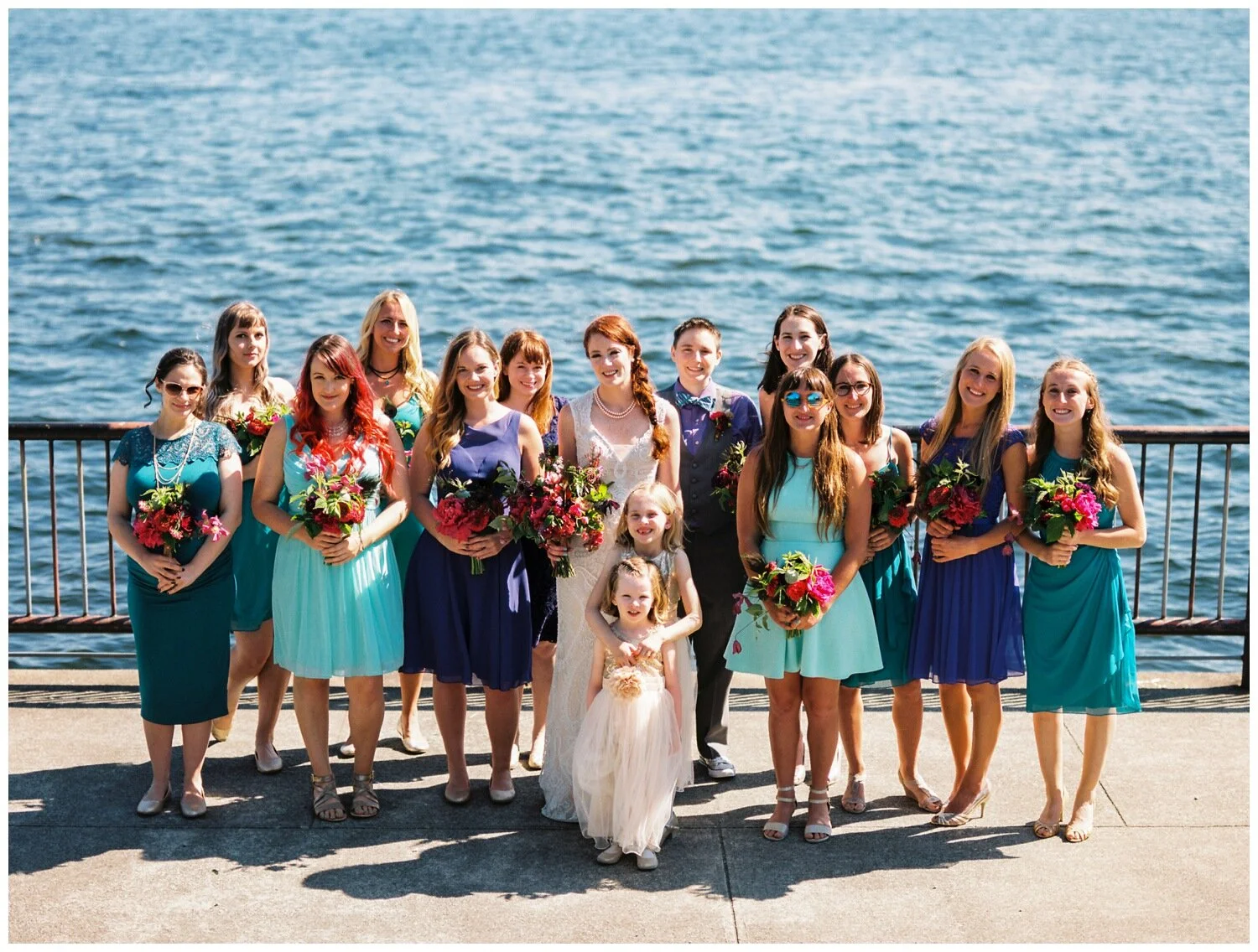
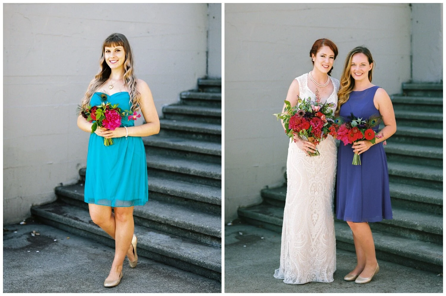
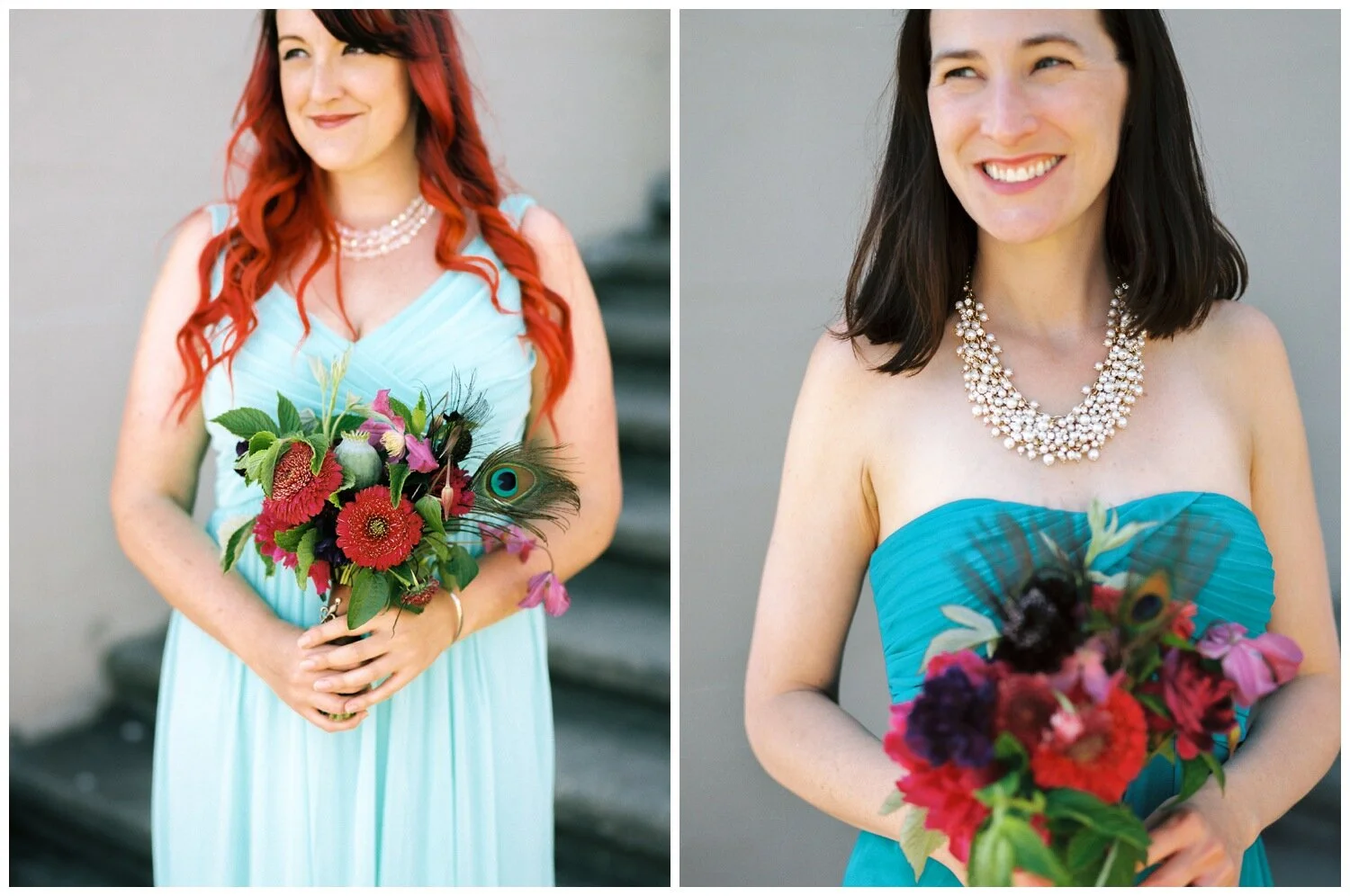
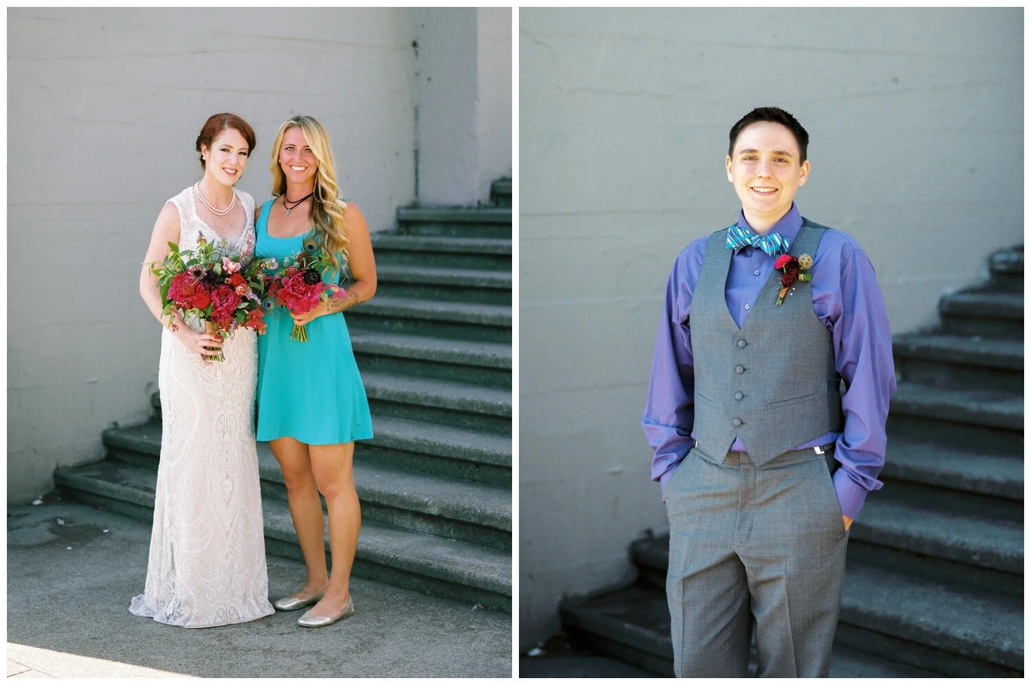
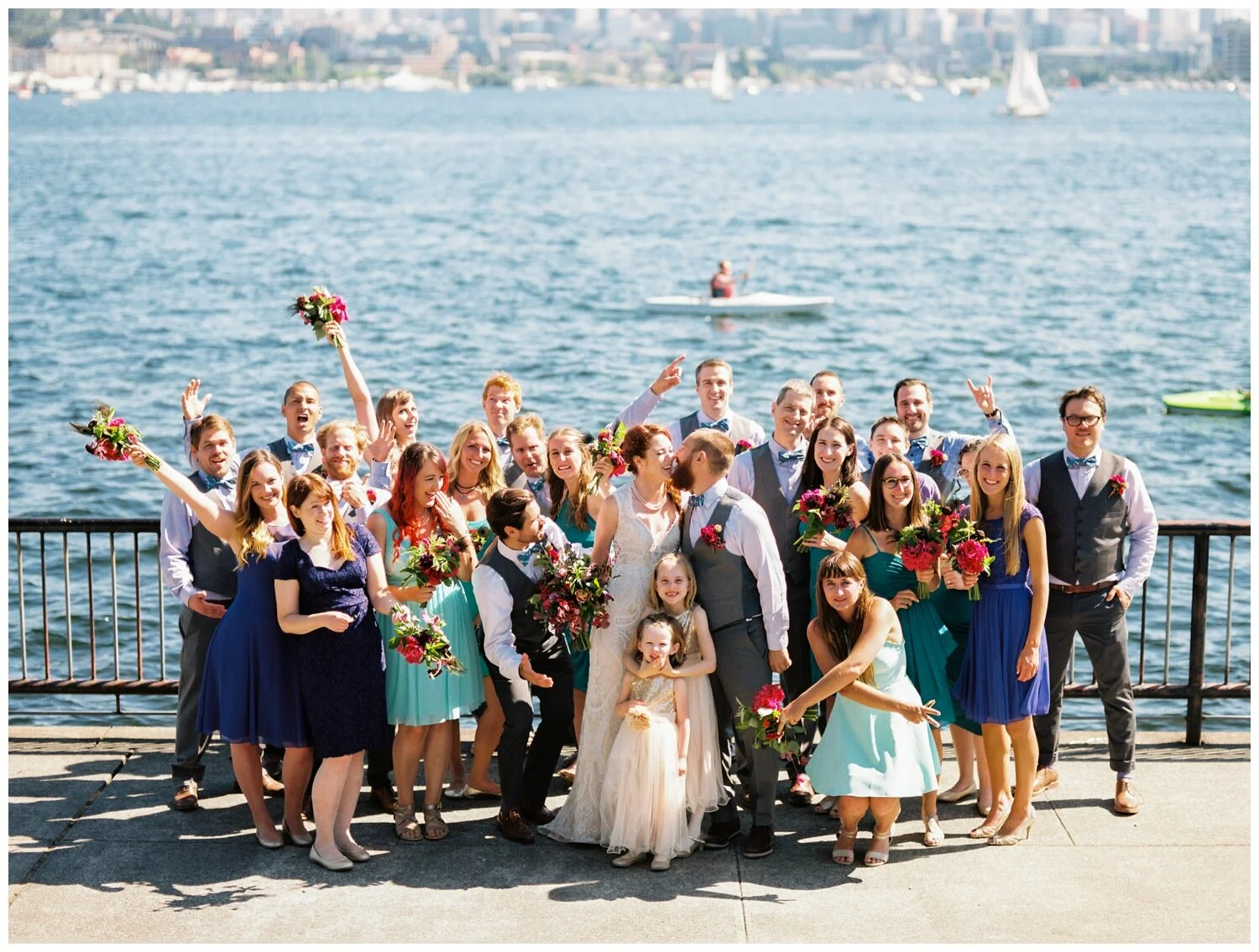
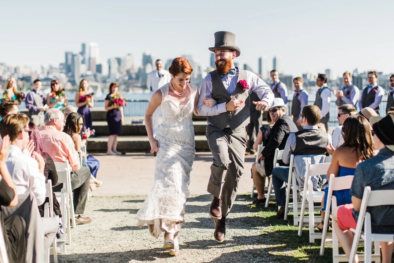
Here’s one of the brightest wedding parties I have ever photographed, and this is one example of a great time to go super bold or go home! Lizzy & Matt were engaged at Mardi Gras in New Orleans, so it was only fitting that they chose a color palette of teal and purple – the unofficial colors of Mardi Gras. Lizzy & Matt’s ceremony was outdoors on the Seattle waterfront, so to compliment their outdoor, laid back vibe they opted for knee length bridesmaid dresses. The ladies were assigned a specific color swatch but encouraged to find a dress that suited their own style within those parameters. By having a balance of purple and teal, which some dresses that were a little brighter and some dresses that were a little darker in saturation, this bridal party style really pops right out of the photos. I love the fact that Lizzy & Matt opted for bold florals to continue their Mardi Gras vibe but ensured that the color and texture of the flowers would stand out against the bridesmaid dresses by being strong contrasting colors. If you feel called to go bold and colorful, go for it! Consider limiting your color choices so that your attendants still feel coordinated without being too matchy matchy and embrace their individual style by giving them freedom over the exact dress style they would like to wear.
Every wedding is different, and every couple should feel encouraged to embrace their own style and preferences. Start with a jumping off point – perhaps you’re inspired by a specific color or you’re wanting something that compliments your venue. Once you have your inspiration or key focus decided, build your color palette and wedding party style around that by choosing colors and styles that feature contrasting texture, less saturated and lighter hues that are close in color, as well as neutrals to round everything out. You are sure to form a perfect mismatched bridesmaid ensemble by following these steps and remembering to have fun!
And here’s a note that I hope will be helpful – I majored in fine art in college and studied color theory extensively. It may sound cheesy but creating color families is a lot of fun for me and I am always happy to help couples that book me work on these details if I can be of assistance!
